Presentation/Graphics
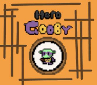
At this stage I was experimenting with the final graphics for my game. I focused on replacing the title screens' placeholders with better fonts and cover, I also did the same for the other screens that pop up throughout the game (e.g. game over screen).


I shared a potential title screen design with some family and friends, while not finished (buttons, in place), it gave a rough idea of how it would look.
I made some small additional tweaks to some level designs, to make them flow a bit better, I mainly changed the shooting mini-game to have a different color palette because I felt like the purple floor clashed a bit with the slugs and game mood. I did this by re-using a tile map from a different level.
Along with adjusting the graphics, I also made buttons/scene switchers work.
Feedback:
-Some more gradients incorporated in the color scheme might improve the overall design/graphics of the game
-Background colors take away too much attention from the main elements trying to be communicated in the design, maybe try using less bright/vibrant colors
Hero Gooby
| Status | In development |
| Author | AFnnausco05 |
More posts
- Supporting documentationOct 30, 2024
- TestingOct 27, 2024
- Polish and UIOct 18, 2024
- Game TestingOct 17, 2024
- Enemies, Interactions, and PuzzlesOct 05, 2024
- Basic Level BlockingSep 28, 2024
- Player MovementSep 22, 2024
- Game ConceptSep 12, 2024
Leave a comment
Log in with itch.io to leave a comment.